
Introduction:
Tactile paving, commonly referred to as blind paths or guideways, plays a crucial role in ensuring the safe navigation of visually impaired individuals within urban landscapes. Beyond its tactile features, the strategic use of color can significantly enhance the visibility and usability of these pathways. This article delves into the art and science of color selection for tactile paving, exploring how color can improve accessibility, aesthetics, and overall user experience.
Understanding Color in Accessibility Design:
Color in accessibility design serves dual purposes: it enhances visual cues for those with partial sight and adds aesthetic value to the urban environment. For tactile paving, color choice is not merely aesthetic; it must be carefully considered to ensure high contrast and clarity, aiding in the identification and navigation of pathways.
Key Principles of Color Selection:
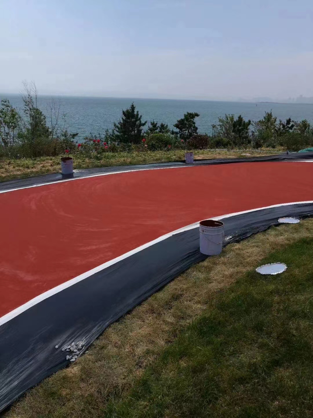
1. High Contrast:
Principle: Utilize high-contrast colors between the tactile paving and its surrounding surfaces.
Application: For instance, bright yellow or red tactile paving stands out against gray or black asphalt, making it easier to detect and follow.
2. Color Recognition:
Principle: Choose colors that are easily recognizable and distinguishable even in low-light conditions.
Application: Primary colors like red, blue, and yellow are often preferred due to their high visibility and ease of recognition.
3. Color Coding:
Principle: Implement color coding to differentiate different types of tactile paving, such as pedestrian crossings, bus stops, or hazards.
Application: For example, using blue for bus stops and red for pedestrian crossings can provide additional context and guidance.
4. Durability and Maintenance:
Principle: Ensure that the chosen colors are fade-resistant and maintain their vibrancy over time.
Application: Opt for durable, UV-stable pigments and materials that can withstand environmental wear and tear.
5. Cultural Sensitivity:
Principle: Consider cultural connotations and preferences when selecting colors.
Application: In multicultural cities, it's essential to choose colors that are universally accepted and do not carry negative connotations in any local culture.
Case Study: Successful Color Implementation:
In a recent urban renewal project in a major city, planners implemented a color-coded tactile paving system. The project involved painting tactile paving in bright yellow for pedestrian crossings, blue for bus stops, and green for areas with potential hazards like construction zones. The high-contrast colors were chosen to ensure maximum visibility, even in low-light conditions. The result was a visually striking and highly functional tactile paving system that significantly improved navigation for visually impaired residents and visitors.
Challenges and Future Directions:
Despite the benefits, color selection for tactile paving faces challenges, including maintaining color vibrancy over time, ensuring color accessibility for color-blind users, and balancing aesthetic appeal with functional needs. Future research should focus on developing more durable colorants, exploring color combinations that cater to color-blind users, and integrating technology to enhance color recognition and navigation.
Conclusion:
Color selection for tactile paving is a delicate balance of art and science, requiring a deep understanding of accessibility principles, color psychology, and urban aesthetics. By carefully choosing high-contrast, easily recognizable colors that are fade-resistant and culturally sensitive, cities can create tactile paving systems that are not only functional but also visually appealing. As technology and research advance, the potential for innovative color solutions in tactile paving continues to grow, promising even greater accessibility and user satisfaction in urban environments. By prioritizing these principles, we can create inclusive, vibrant, and safe urban spaces for all.
contact
Be the first to know about our new product launches, latest blog posts and more. Chinese brand Kunjie Materials Company is an environmentally friendly enterprise that provides colored anti-skid pavement, ceramic particle anti-skid pavement, water-based polymer colored pavement, pe... Any question or request?
Click below, we’ll be happy to assist. contact